
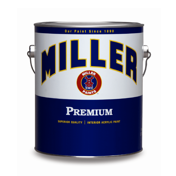
Miller Paint Company is a Portland-based company that has been around for more than 100 years. Customers have recognized the signature “white label” and windmill of Miller Paint cans for generations. The label had become a nostalgic icon in Portland, marking an emotional connection for customers that signified Miller Paint as the local, honest paint expert. The company wanted to update its brand, packaging, and modernize its retail support materials without losing the brand equity and emotional tie to the current brand.
Miller’s formative “arched” name was the most familiar element of their brand, so, the new design incorporated the “classic” arch while updating the typeface and colors to a more modern look. In addition, a new color strategy was introduced that color coded categories of paint so customers could easily identify interior or exterior paint products in the store. The color was then reflected in all supporting collateral and signage, i.e., the interior paint brochure was blue and the exterior paint brochure was red.


